Accessibility
Web Accessibility - Optimizing Experience for Users with Impairments
Imagine that thousands of users visit your blog daily to read posts about technology, lifestyle, or coding. Now, picture a user named Sarah, who is visually impaired and relies on a screen reader to navigate your site. If your application isn't designed with accessibility in mind, Sarah might struggle to read posts, filter them by tags, or even find the navigation menu. This isn't just a minor inconvenience—it could exclude her entirely from using your app. Accessibility (often abbreviated as a11y) ensures that everyone, regardless of physical or cognitive impairments, can use your application effectively.
In this lecture, we'll explore web accessibility, why it’s critical in full-stack development, and how to implement it in our blogging application. Accessibility isn’t just a nice-to-have; it’s a legal and ethical responsibility. In many countries, laws like the Americans with Disabilities Act (ADA) or Web Content Accessibility Guidelines (WCAG) mandate accessible websites. Plus, it improves user experience for all users, boosts SEO, and expands your audience.
Let’s start with a common misconception: many developers think accessibility is just about adding alt text to images or making text bigger. While those are important, accessibility is a holistic approach that considers diverse user needs—visual, auditory, motor, and cognitive. For example, assuming all users can use a mouse or see vibrant colours can lead to designs that exclude people. Today, we’ll challenge these assumptions and build an accessible blogging app step-by-step.
Section 1: Understanding Accessibility and WCAG Principles
What is Web Accessibility?
Web accessibility means designing and developing websites so that people with disabilities can perceive, understand, navigate, and interact with them. The Web Content Accessibility Guidelines (WCAG) provide a global standard, organised around four principles:
- Perceivable: Information must be presented in ways users can perceive (e.g., text alternatives for images).
- Operable: Users must be able to operate the interface (e.g., keyboard navigation).
- Understandable: Content and interfaces must be clear and predictable.
- Robust: Content must work with current and future assistive technologies.
Common Misconceptions
- Myth: Accessibility is only for blind users.
Reality: It benefits users with hearing impairments, motor disabilities, cognitive challenges, or temporary impairments (e.g., a broken arm). - Myth: Accessibility makes websites ugly or boring.
Reality: Accessible design can be beautiful and modern with proper techniques.
Our Example: The Blogging App
Let’s apply these principles to our blogging app. Users can browse posts, filter them by date or tag, and admins can add/edit posts. We’ll ensure Sarah (using a screen reader) and John (with motor impairments, using a keyboard) can use it seamlessly.
Section 2: Building an Accessible Blogging App
Step 1: Semantic HTML for Structure
Semantic HTML (e.g., <header>, <nav>, <main>) helps screen readers understand the page structure. Non-semantic elements like <div> alone are harder for assistive technologies to interpret.
Simple Example:
<div>
  <div>Blog Title</div>
  <div>Home | Posts | About</div>
</div>
This lacks meaning. A screen reader might not identify the navigation.
Improved Example:
<header>
  <h1>Tech Blog</h1>
  <nav aria-label="Main navigation">
    <ul>
      <li><a href="/">Home</a></li>
      <li><a href="/posts">Posts</a></li>
      <li><a href="/about">About</a></li>
    </ul>
  </nav>
</header>
- Why it’s better:
<header>and<nav>provide structure. Thearia-labeltells screen readers this is the main navigation. - How it helps: Sarah’s screen reader announces “Main navigation” and lists links clearly.
Step 2: ARIA for Enhanced Semantics
ARIA (Accessible Rich Internet Applications) adds roles and attributes to make dynamic content accessible. For example, in our blog’s filter feature, users can select tags (e.g., “JavaScript,” “CSS”) to filter posts.
Example: Accessible Filter Dropdown
<div role="combobox" aria-label="Filter posts by tag">
  <button aria-expanded="false" aria-controls="tag-list">Select Tag</button>
  <ul id="tag-list" hidden>
    <li><button>JavaScript</button></li>
    <li><button>CSS</button></li>
  </ul>
</div>
- How it works:
role="combobox"tells assistive technologies this is a dropdown.aria-expandedindicates whether the list is open.aria-controlslinks the button to the list. - Advantages: Sarah can navigate and select tags using her screen reader.
- Disadvantages: Overusing ARIA can confuse assistive technologies if native HTML elements (e.g.,
<select>) would suffice.
Step 3: Keyboard Navigation
Users like John, who rely on keyboards, need to navigate without a mouse. Ensure all interactive elements (buttons, links, forms) are focusable using the Tab key.
Example: Admin Post Editor In the admin panel, there’s a form to add a new post:
<form>
  <label for="title">Post Title</label>
  <input id="title" type="text" required>
  <label for="content">Content</label>
  <textarea id="content" required></textarea>
  <button type="submit">Save Post</button>
</form>
- How it works:
<label>connects to inputs viaforattributes, so screen readers announce “Post Title, edit” when focused. TheTabkey moves between fields. - Test it: Use
Tabto navigate. Ensure the focus order is logical (e.g., title → content → button). - Pitfall: Avoid
tabindexvalues greater than 0, as they disrupt natural focus order.
Step 4: Visual Accessibility
Ensure sufficient color contrast and avoid relying solely on color to convey information. For example, in our blog’s tag filter, don’t just use a red border to indicate a selected tag.
Example: Tag Filter with Visual Cues
.tag-button {
  background: #fff;
  border: 2px solid #000;
}
.tag-button.selected {
  border-color: #0066cc;
  background: #e6f0ff;
  text-decoration: underline;
}
- Why it works: The underline and background change indicate selection without relying on color alone. The contrast ratio meets WCAG’s 4.5:1 minimum.
- Tool: Use WebAIM’s Contrast Checker to verify ratios.
Step 5: Testing Accessibility
Manually test with:
- Screen readers: NVDA (Windows), VoiceOver (Mac).
- Keyboard: Navigate using only
Tab,Enter, and arrow keys. - Automated tools: axe DevTools or Lighthouse.
Example Test:
- Load the blog’s homepage.
- Use NVDA to navigate. Ensure the screen reader announces the navigation, post titles, and filter options.
- Use
Tabto check focus order. Fix any skipped elements.
Section 3: Advanced Accessibility Features
Dynamic Content Updates
In our blog, when a user filters posts by tag, the post list updates dynamically via JavaScript. Screen readers need to know about these changes.
Example: Live Region for Post Updates
<div aria-live="polite" id="post-list">
  <!-- Posts dynamically inserted here -->
</div>
<script>
  function updatePosts(tag) {
    const postList = document.getElementById('post-list');
    postList.innerHTML = `<p>Showing posts tagged ${tag}</p>`;
  }
</script>
- How it works:
aria-live="polite"tells screen readers to announce updates when the user isn’t busy. Sarah hears “Showing posts tagged JavaScript” after filtering. - Pitfall: Avoid
aria-live="assertive"unless the update is critical, as it interrupts the user.
Accessible Admin Features
The admin panel lets admins edit posts. Ensure modals (e.g., “Edit Post” popup) are accessible.
Example: Accessible Modal
<div role="dialog" aria-labelledby="modal-title" aria-modal="true">
  <h2 id="modal-title">Edit Post</h2>
  <form>
    <label for="edit-title">Title</label>
    <input id="edit-title" type="text">
    <button type="submit">Save</button>
    <button type="button" onclick="closeModal()">Cancel</button>
  </form>
</div>
<script>
  function openModal() {
    const modal = document.querySelector('[role="dialog"]');
    modal.hidden = false;
    modal.querySelector('input').focus();
  }
  function closeModal() {
    const modal = document.querySelector('[role="dialog"]');
    modal.hidden = true;
  }
</script>
- How it works:
role="dialog"andaria-modal="true"trap focus within the modal. Focusing the input on open helps keyboard users. - Advantages: John can navigate the modal using
Taband close it withEsc. - Disadvantages: Managing focus in complex modals requires careful JavaScript.
Conclusion: Key Takeaways and Best Practices
Accessibility is about inclusivity, ensuring every user can engage with your application. In our blogging app, we:
- Used semantic HTML and ARIA to make navigation and dynamic content accessible.
- Ensured keyboard navigation and visual accessibility for diverse needs.
- Tested with tools and assistive technologies to catch issues early.
Best Practices:
- Follow WCAG guidelines (aim for Level AA compliance).
- Use semantic HTML as the foundation.
- Test with real users and assistive technologies.
- Keep accessibility in mind from the start, not as an afterthought.
Common Pitfalls:
- Overusing ARIA when native HTML works.
- Ignoring keyboard navigation or focus management.
- Relying solely on automated tools—manual testing is essential.
Resources:
By prioritizing accessibility, you’re not just building a better blogging app—you’re creating a web that’s open to everyone.
Slides

Everyone should be able to read your blog, even Sarah, who relies on a screen reader, or John, navigating by keyboard. Web accessibility ensures inclusivity, meets legal standards, and boosts user experience. Let’s debunk myths and build an accessible app together!
Imagine a user named Sarah, who is visually impaired and uses a screen reader. Without accessibility, she can’t navigate your blogging app to read posts or filter them by tags. Accessibility (a11y) makes your app inclusive, legally compliant, and better for all users.
Laws like the ADA and WCAG guidelines require accessible websites. Ignoring this risks lawsuits and excludes users, while embracing it boosts SEO and reach.
Accessibility helps users with motor, auditory, or cognitive impairments and even temporary issues like a broken arm. It’s about universal design.
WCAG stands for Web Content Accessibility Guidelines, published by the same name. It advises developers to follow simple guidelines to ensure an equitable experience for all users. Let's explore them!
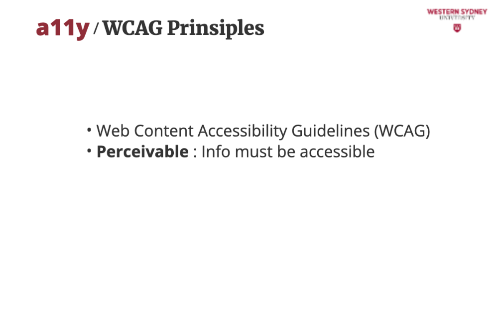
The data in your application must be perceivable for all users. Blind users can not see or interpret images. Thus, users need text alternatives for images or captions for videos so screen readers can convey content.
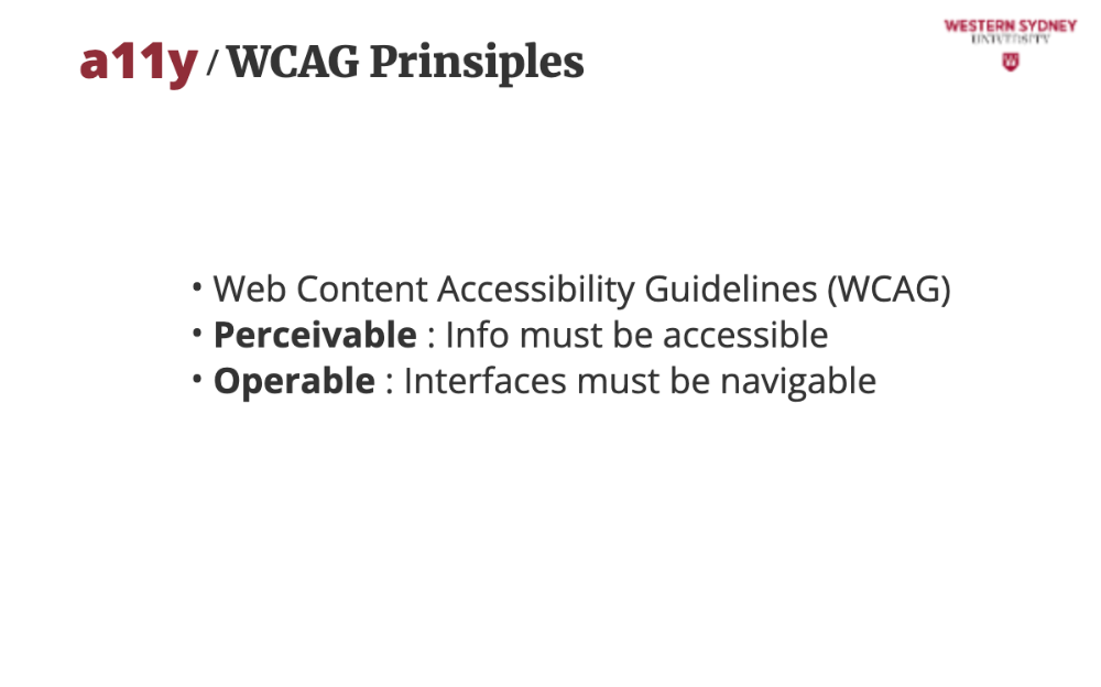
Your interfaces must be operable by various inputs and devices. For example, keyboard-only users like John need to tab through buttons and forms without a mouse.
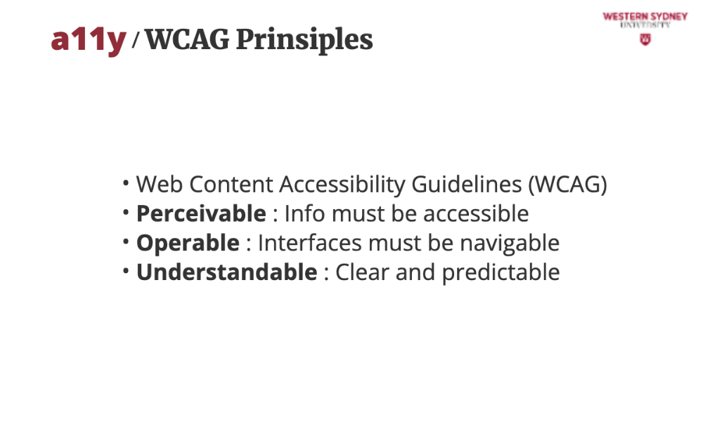
It must be understandable how to access and operate any interactive elements. Forms and errors should be intuitive, avoiding confusion for users with cognitive challenges.
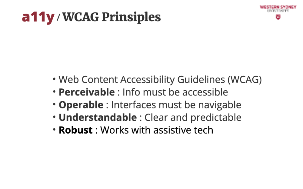
Last, your code must support screen readers and future tools, ensuring long-term compatibility.
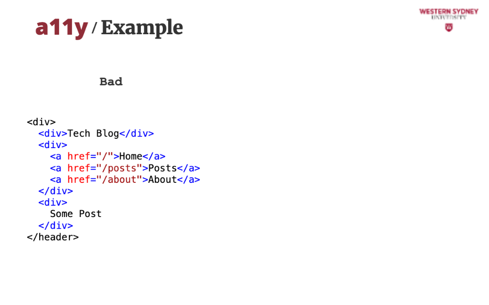
Let me show you an example. This UI visually shows a header and a navigation bar. But for screen readers, it is impossible to know which part of the blog app is it describing. Let's use semantic tags to improve this!
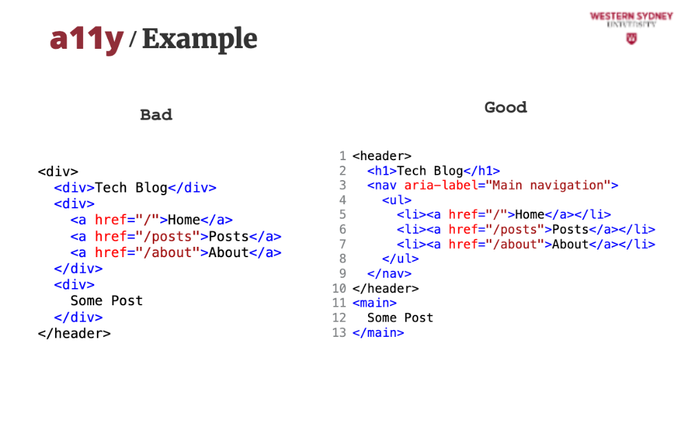
This code creates an accessible navigation bar for our blogging app. Semantic HTML and ARIA ensure screen readers understand the structure, making navigation seamless for users like Sarah.
Using header tells assistive tech this is the top of the page, setting context for the blog’s title and navigation.
The h1 provides a clear page title, helping screen readers announce the blog’s purpose immediately.
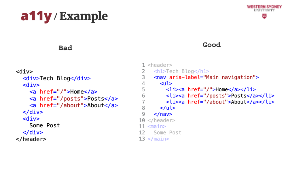
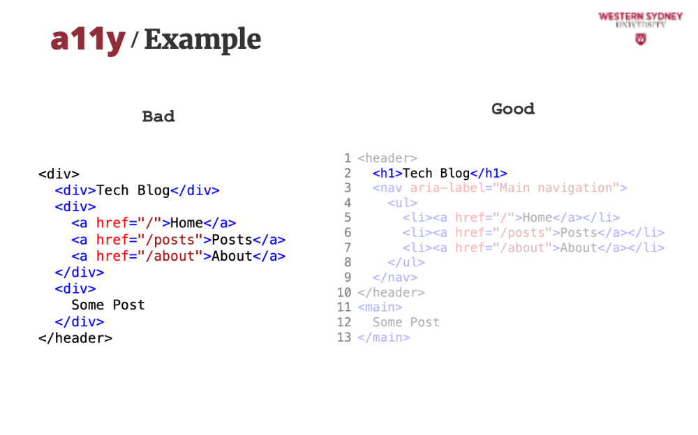
The nav element, along with the aria-label ensures screen readers identify this as the main navigation, avoiding confusion with other nav elements.
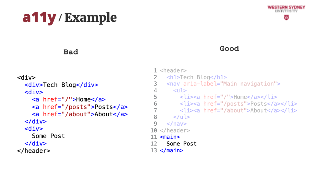
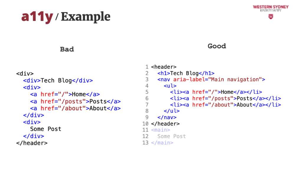
Last, the main element identifies the main content area where your blog post is displayed. With these simple but significant changes, you facilitated your blog for almost all users!
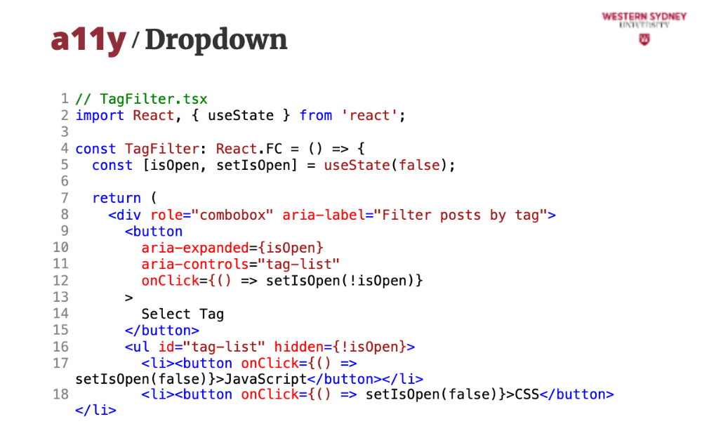
Let's take a look at another example. This dropdown lets users filter blog posts by tags like “JavaScript” or “CSS.” ARIA attributes make it accessible, ensuring Sarah can use it with a screen reader.
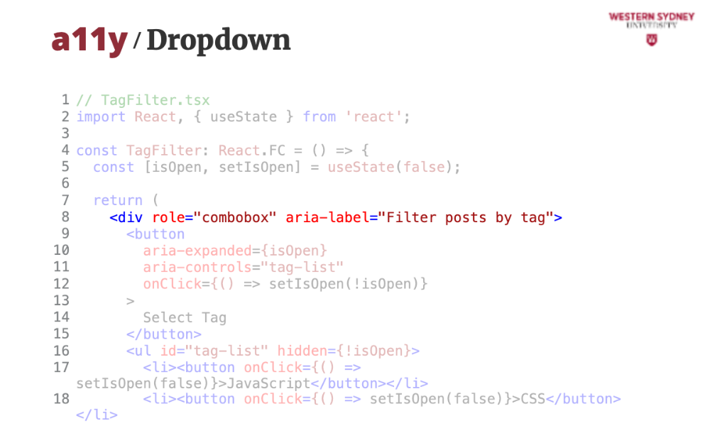
role=combobox tells assistive tech the element is a dropdown, setting expectations for interaction.

aria-expanded indicates whether the dropdown is open, helping screen readers communicate the current state.
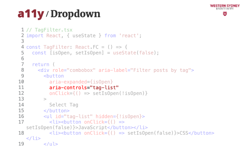
aria-controls links the button to the tag list, so assistive tech knows what the button affects. For full list of aria properties see the WCAG website.
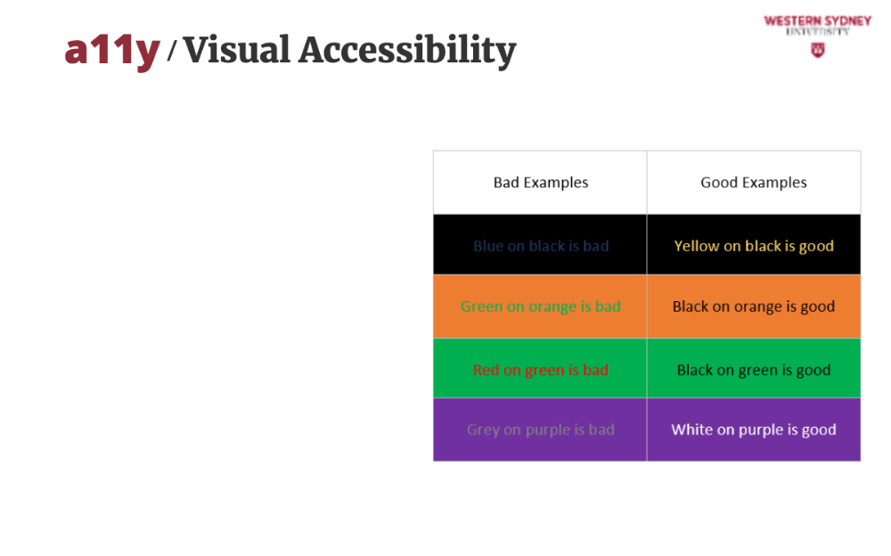
It is also important that your website is readable for people suffering from a number of different vision impairments, such as colour blindness; this diagram compares a low-contrast text (hard to read) with a high-contrast one. In our blog, tag buttons use high contrast to ensure readability for users with visual impairments.
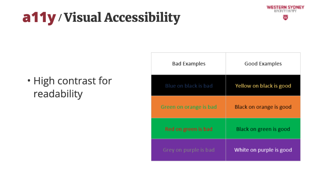
Ensure to use high text contrast for better readability on coloured backgrounds. WCAG requires a 4.5:1 contrast ratio for text. For example, use dark borders and underlines to meet this.
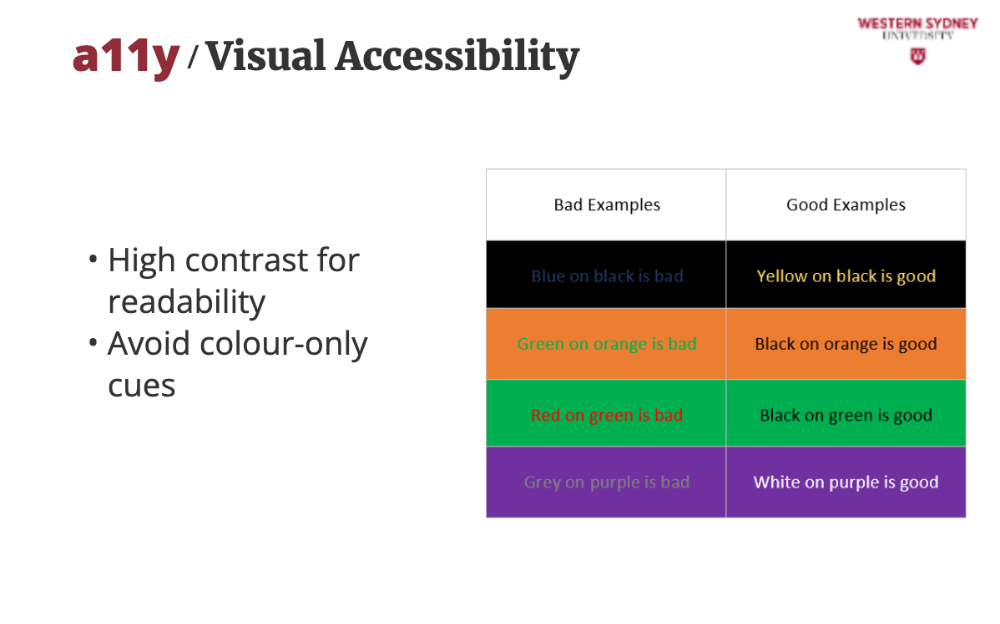
Avoid color-only cues. Use underlines and background changes, not just colour, so users with colour blindness can identify them.
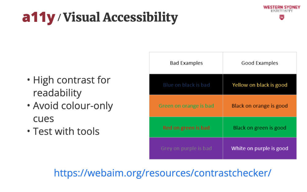
Also, test your final design with tools. Use WebAIM’s Contrast Checker to verify your design meets standards. You can also use Lighthouse in Chrome to check for anny accessibility issues!
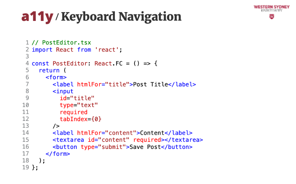
Apart from visual assistance, you should be able to use a keyboard or other assistive devices. This form lets admins create posts. It’s keyboard-accessible, ensuring users like John, who rely on keyboards, can use it easily.
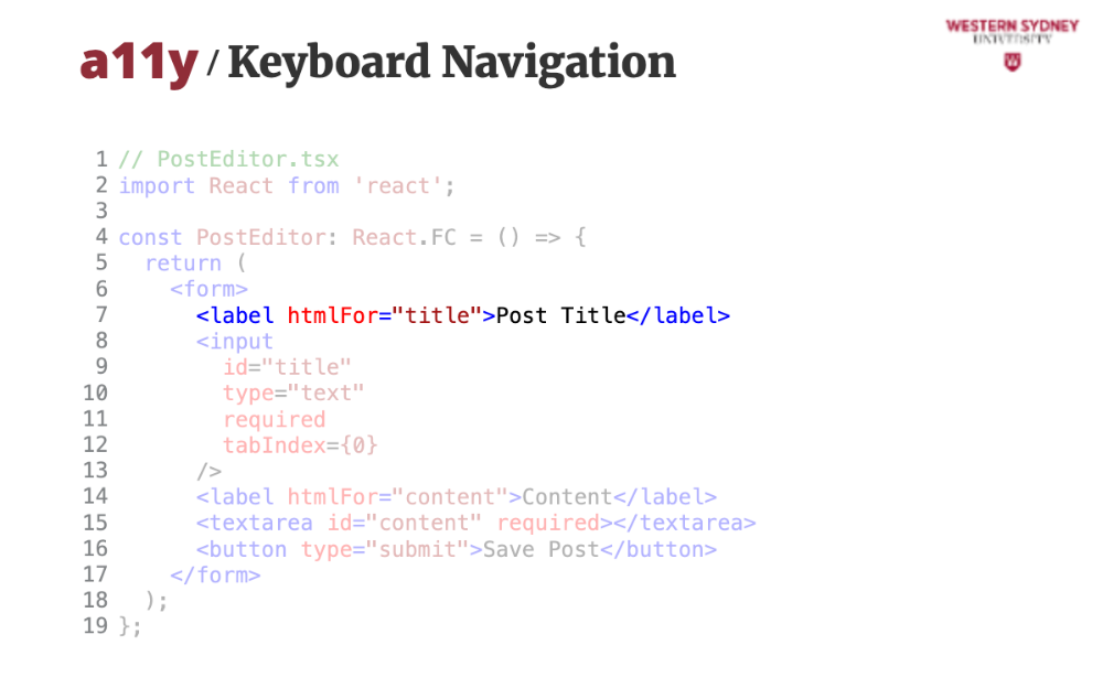
The id attribute must correspond to the htmlFor attribute on the label for keyboard navigation to work.
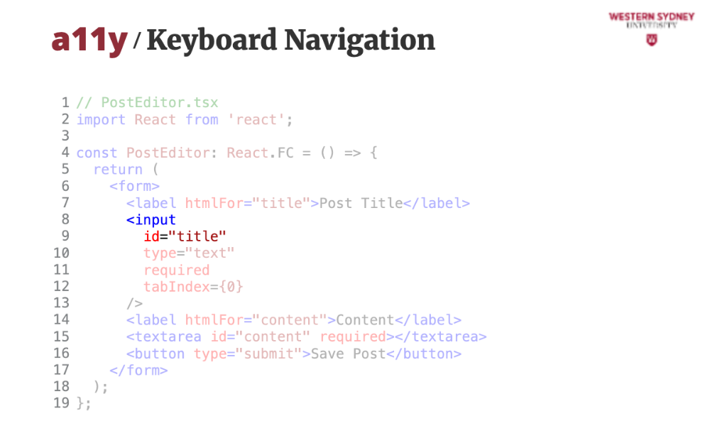
htmlFor attribute connects the label to the input, so screen readers announce “Post Title, edit” when focused.
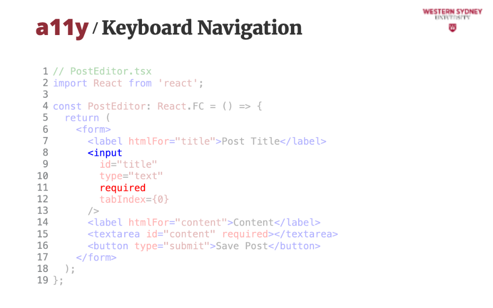
The required attribute ensures the form can’t be submitted incomplete, with clear error messages for accessibility.
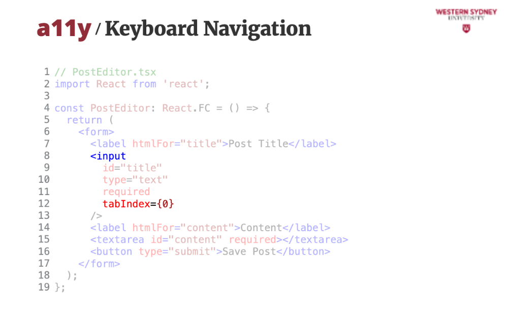
The tabIndex attribute tells the browser in which order the user will switch between focusable elements. This lets you define logical order in which the elements are focused when pressing the Tab key.
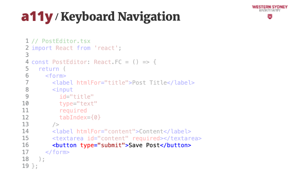
Even though some attributes are optional with default values, it is desired to spell them out for screen readers, such as providing the type=submit value on the button, ensuring the button’s purpose is clear to assistive tech.
Let's discuss a simple case study.
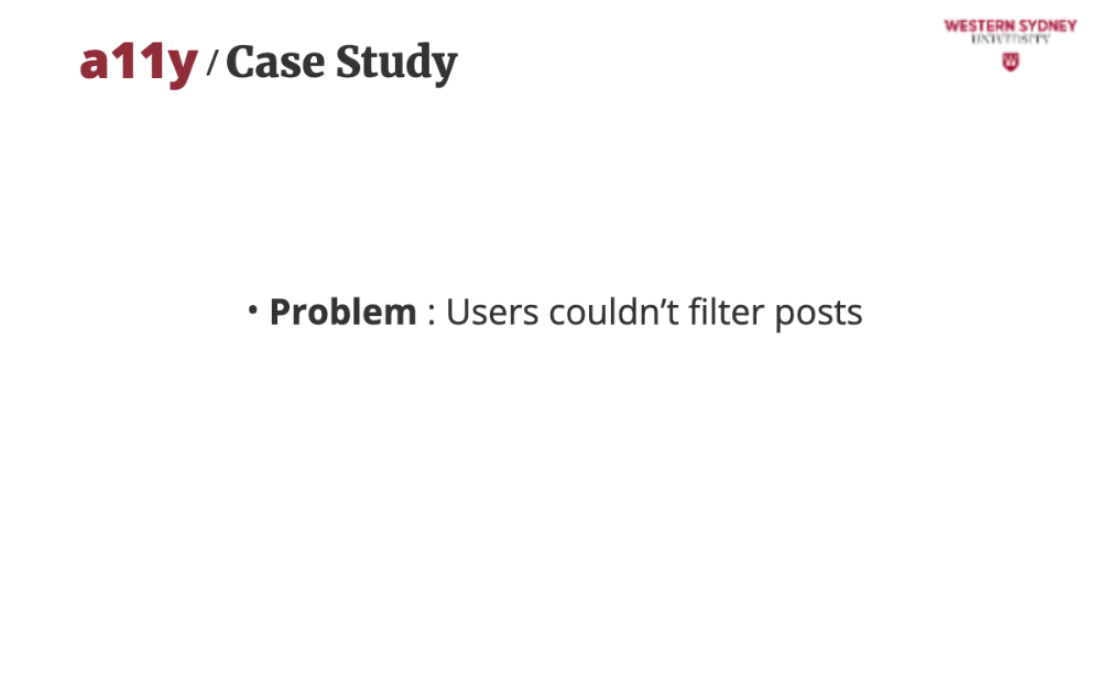
The problem is that Sarah couldn’t use the tag filter with her screen reader, and John struggled with mouse-only buttons.
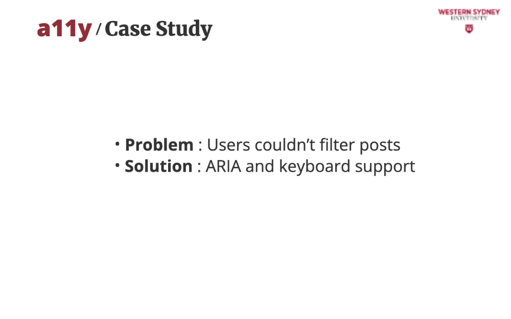
To solve this problem, we made the filter fully accessible by adding role="combobox," aria-expanded, and keyboard navigation.
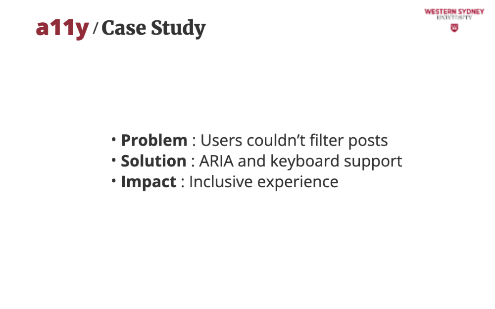
The direct impact is that after testing with NVDA and keyboard navigation confirmed, Sarah and John could use the app seamlessly.
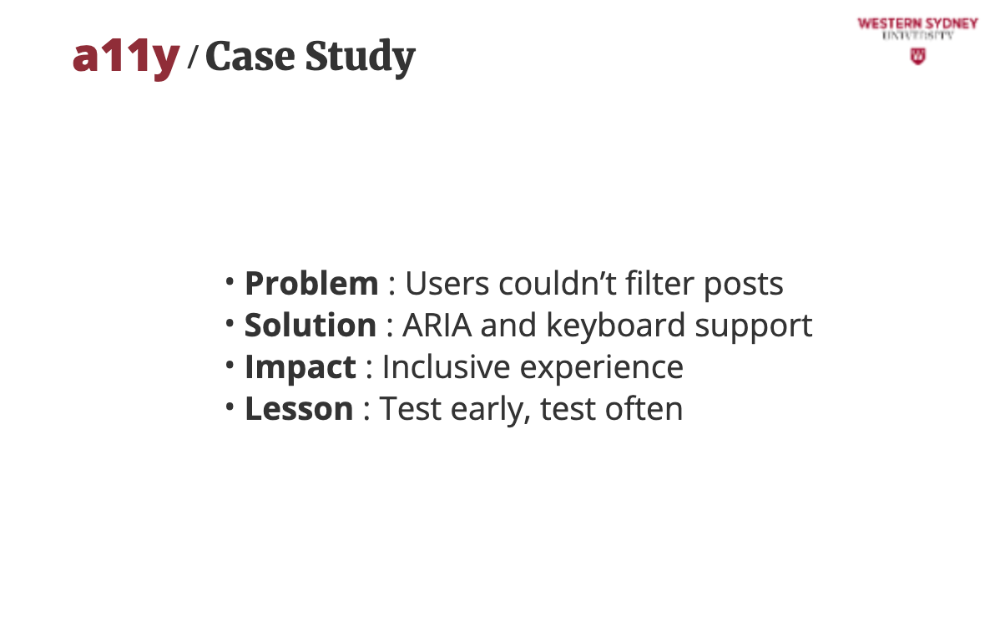
So, please be mindful of all your users and use tools like axe DevTools and manual testing to catch issues before launch.
Let's wrap up!
Use semantic HTML and ARIA attributes, which provide structure and context for assistive technologies, making your app navigable for all users.
Ensure keyboard accessibility so that every interactive element must be reachable and usable via keyboard for users with motor impairments.
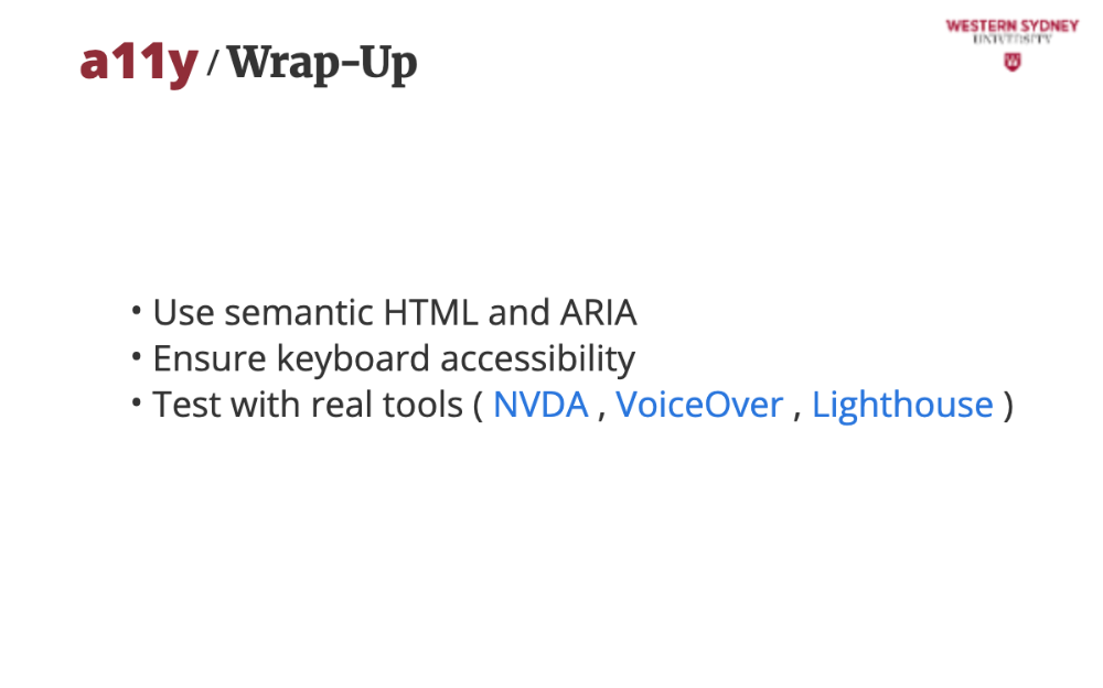
Test with real tools like NVDA, VoiceOver, and Lighthouse help identify and fix accessibility issues.
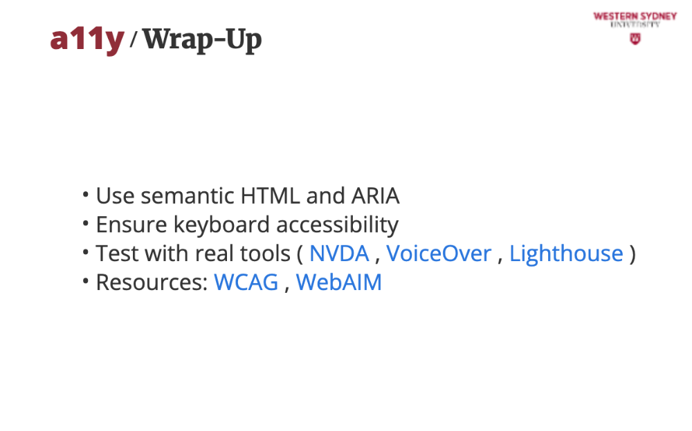
Use available resources from WCAG or WebAIM which provide guidelines and tools to deepen your accessibility knowledge.